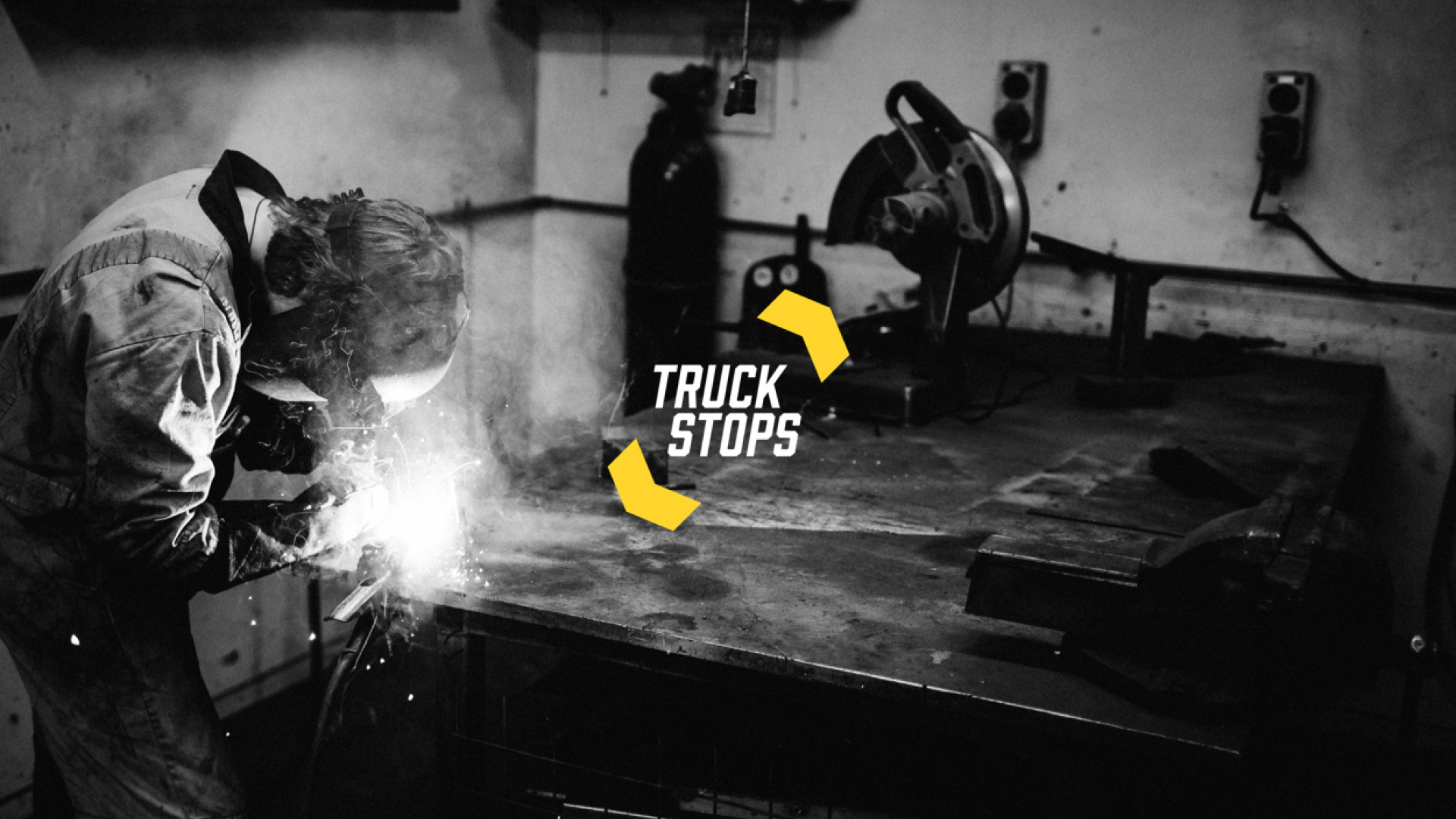
Create a new identity that speaks of Truckstops as a place to keep vehicles on the road. The name had to stay, but the focus on the Stop sign had to go.
Truckstops
Converting a stop to a carry on
Industry
Transport
Services
Design and branding
Let’s deep dive into the details.
The Ask
The Task
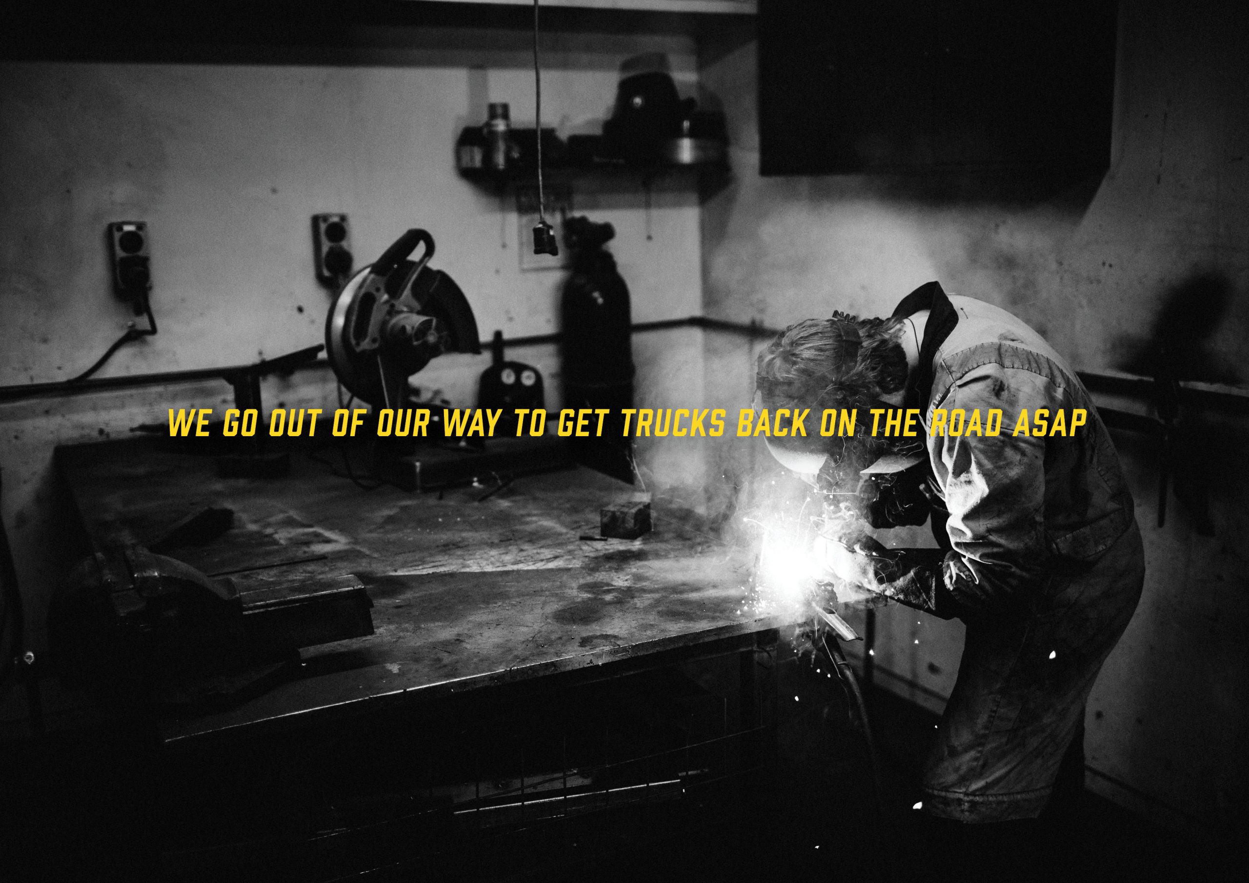
The rebrand started with a lot of research into what Truckstops meant to its customers. We needed to capture the feeling that they were the ones that meant trucks could be on the road quicker and for longer after servicing or breakdown.
The End Game
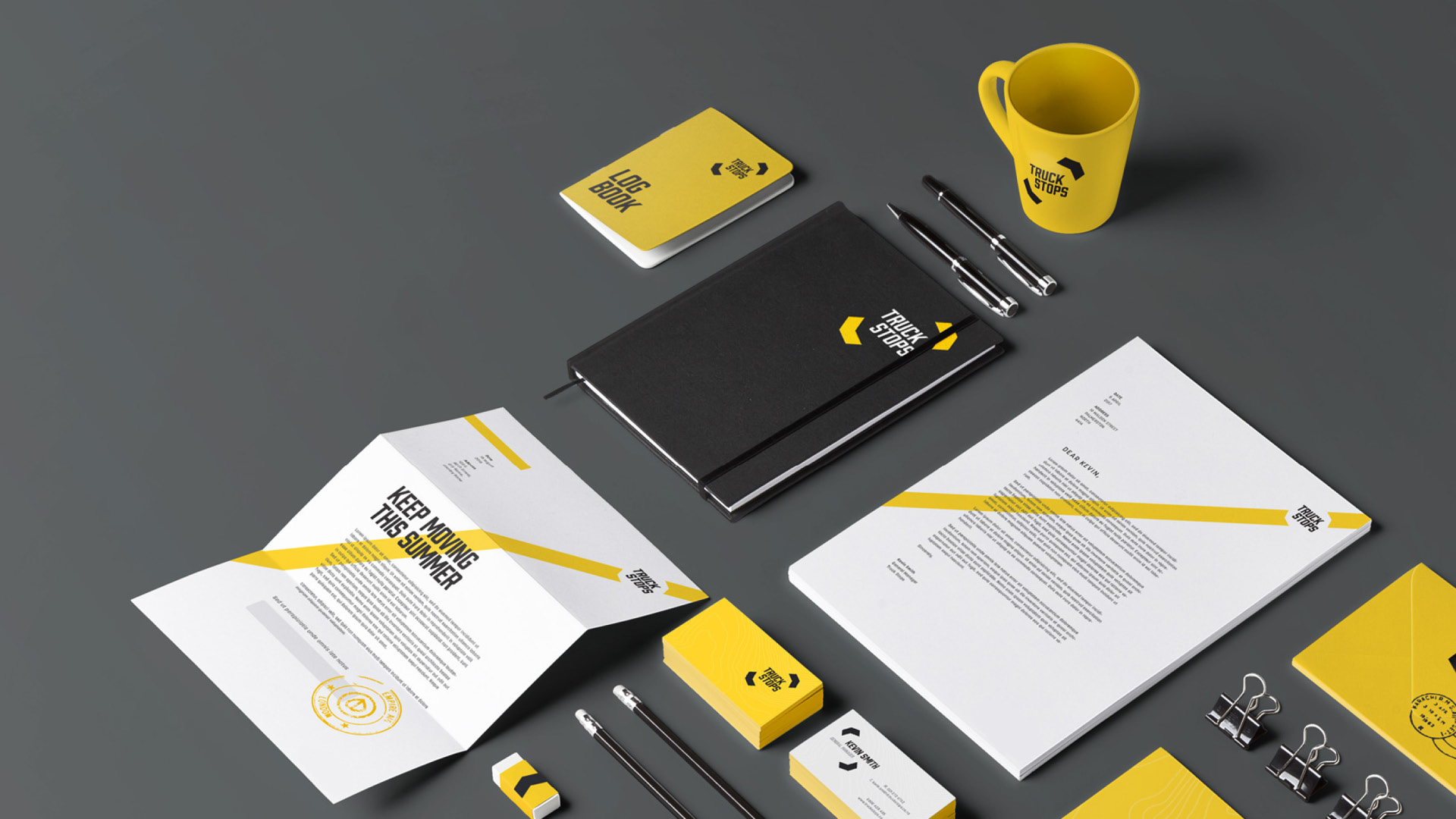
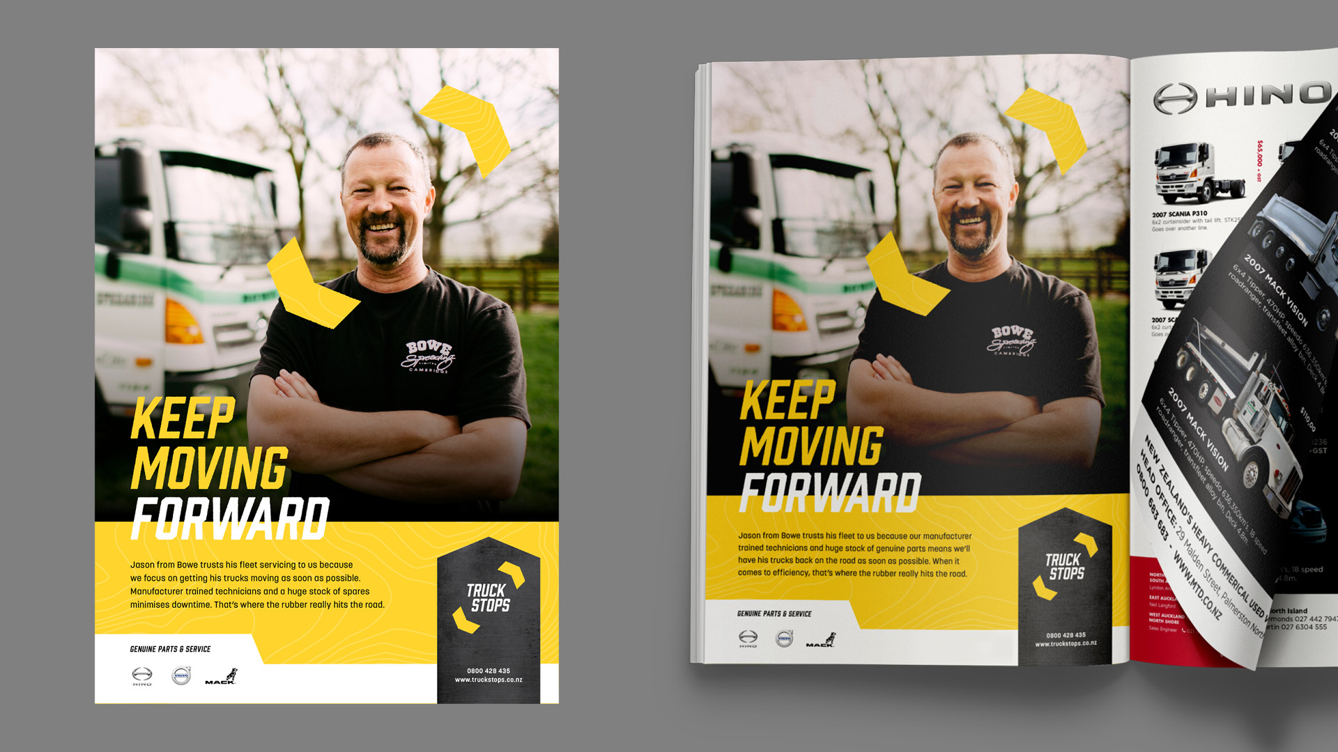
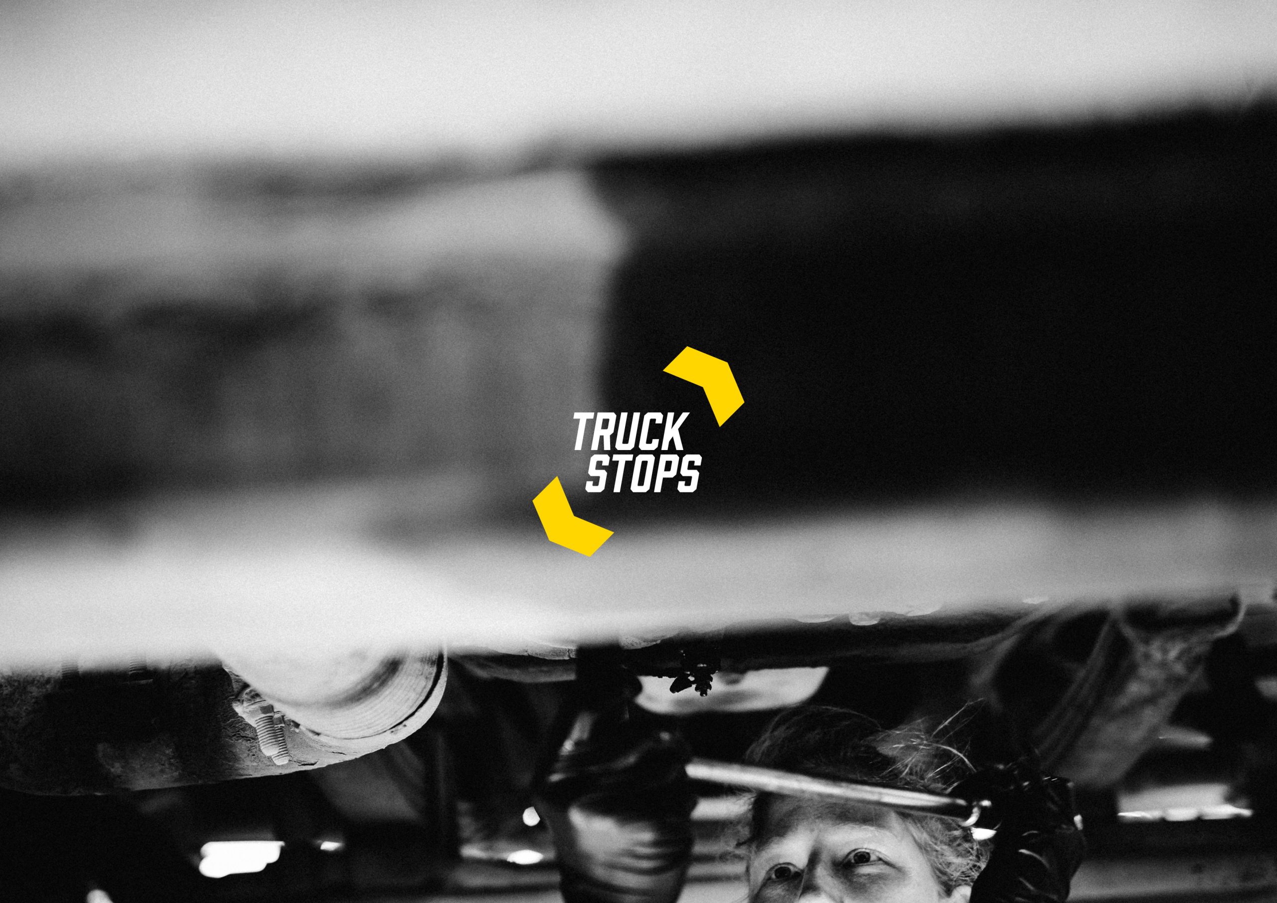
We started with the stop. The shape was synonymous with the company and we needed to keep that sense of heritage, but remove the focus from it. The new logo shows arrows depicting movement - they can be used in different orientations, but the keen eyed among you will see the original stop sign shape in the negative space at the centre of the logo.
The Results
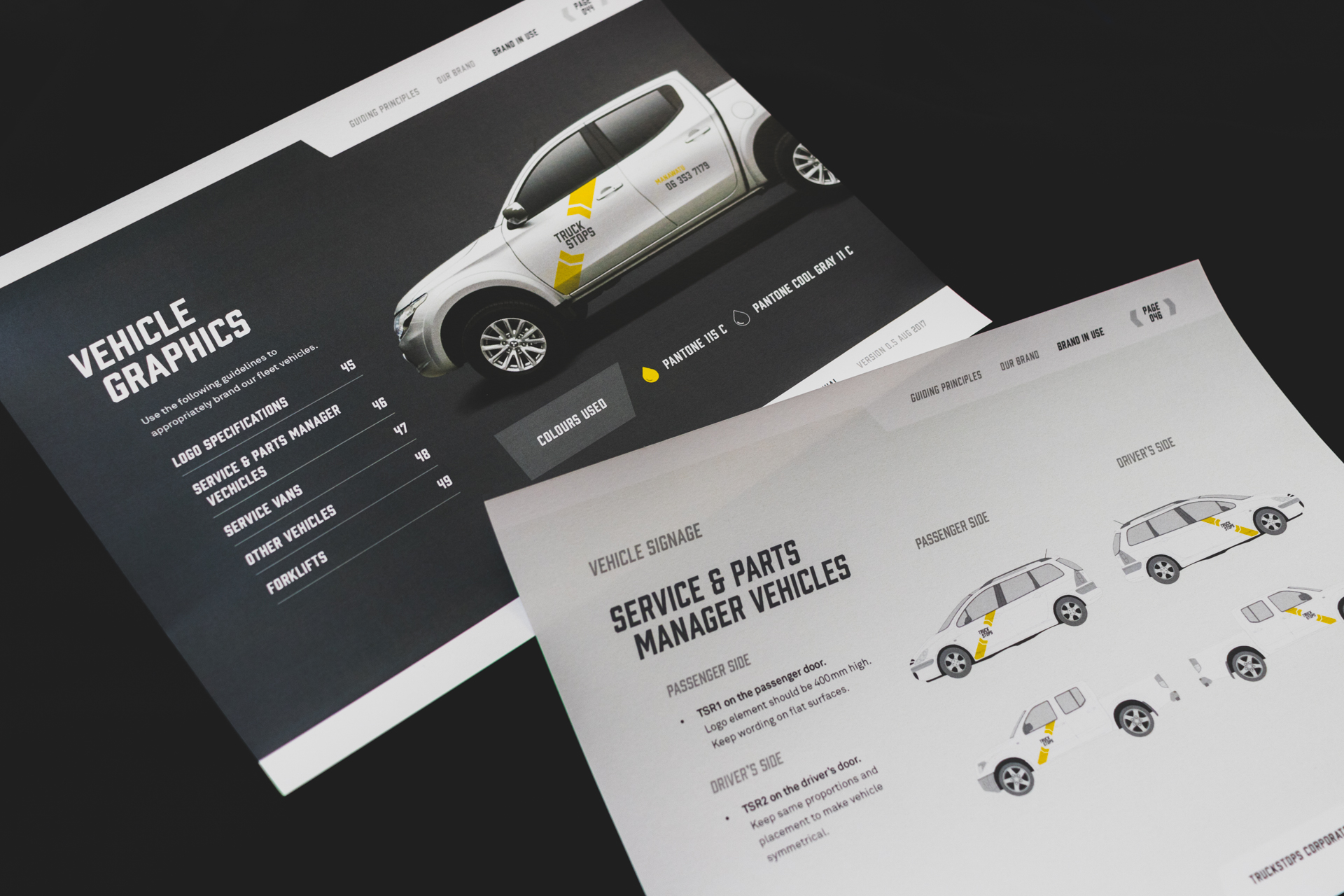
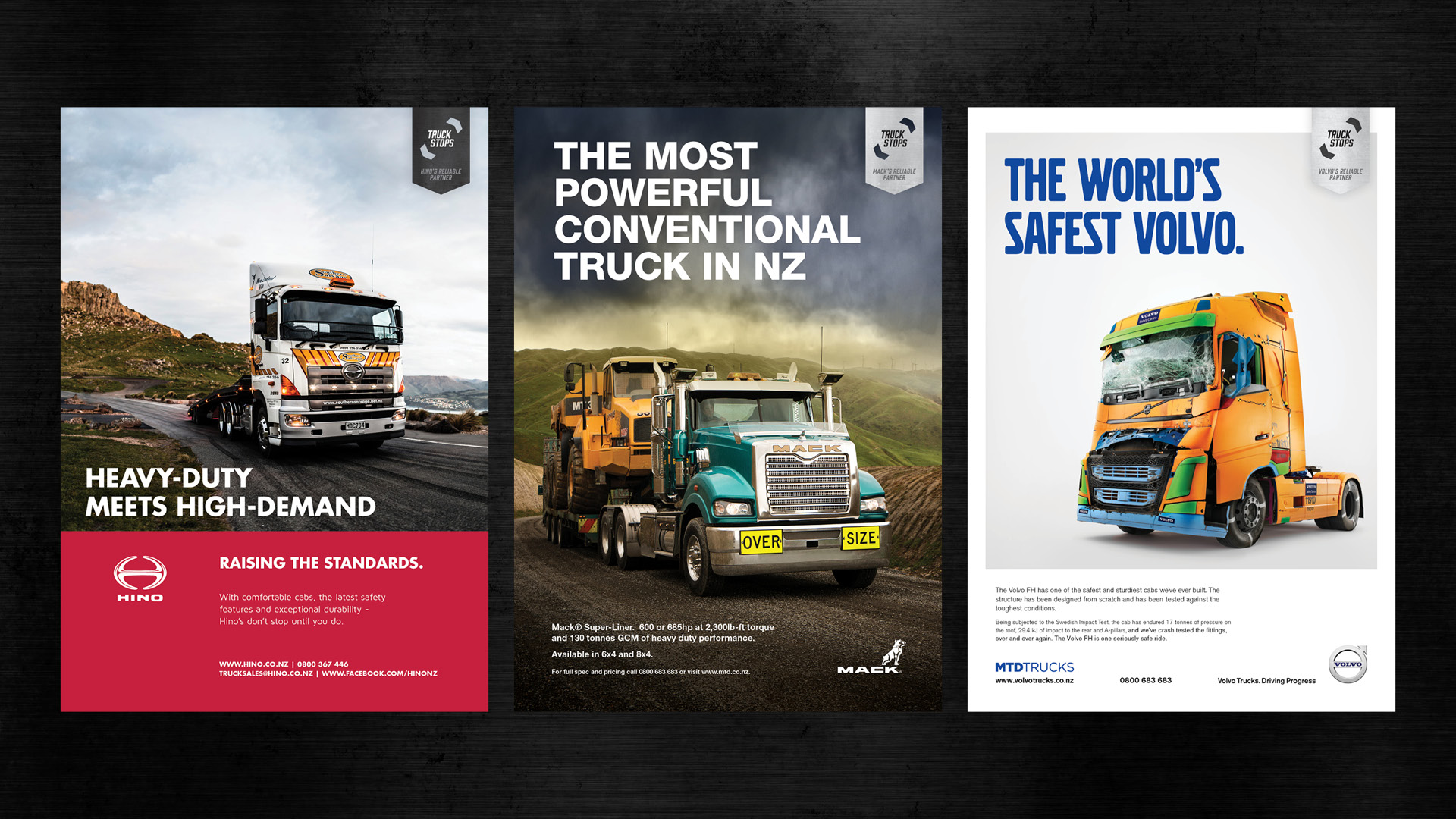
The new identity feels modern and dynamic. It graces vehicles and buildings throughout New Zealand and quickly became a strong iconic brand for those in the trucking industry.
Maintain your iconic image while adapting to the future.
Don’t worry we can walk the walk and talk the talk. See it for yourself.
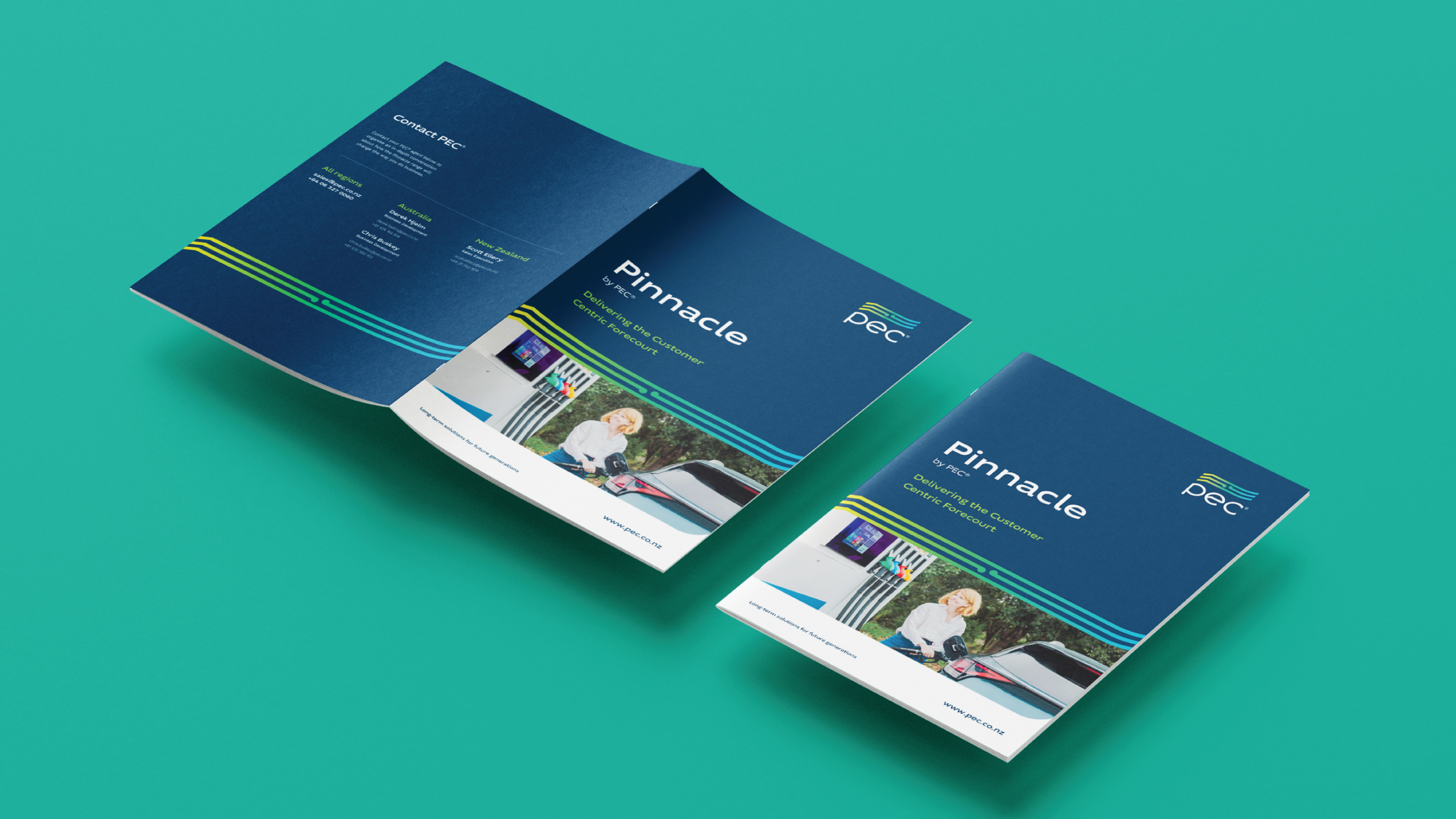
PEC
Communications, Design & Branding
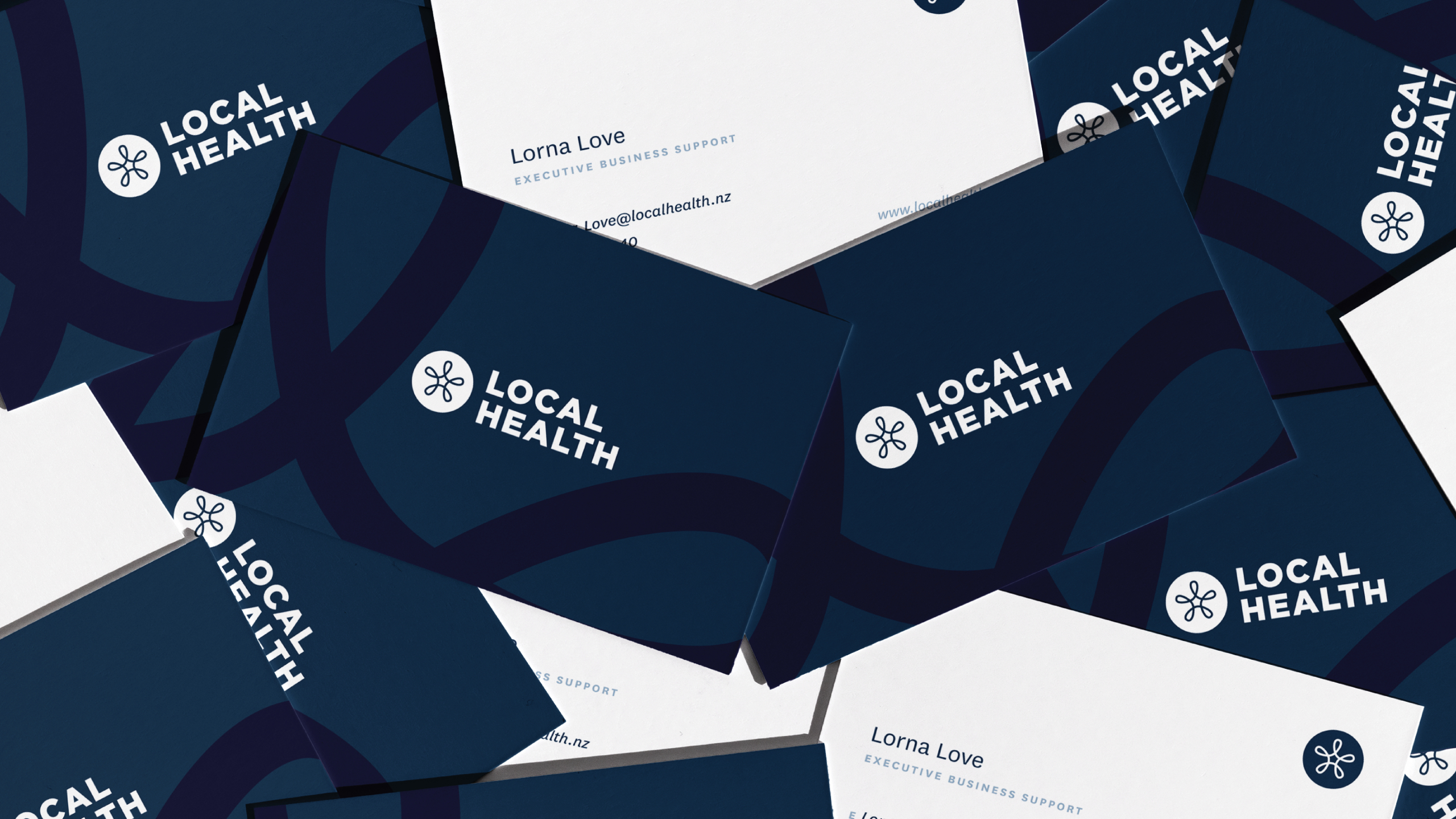
A Healthy New Brand
Campaigns & Strategies, Design & Branding, Everything Else, Websites
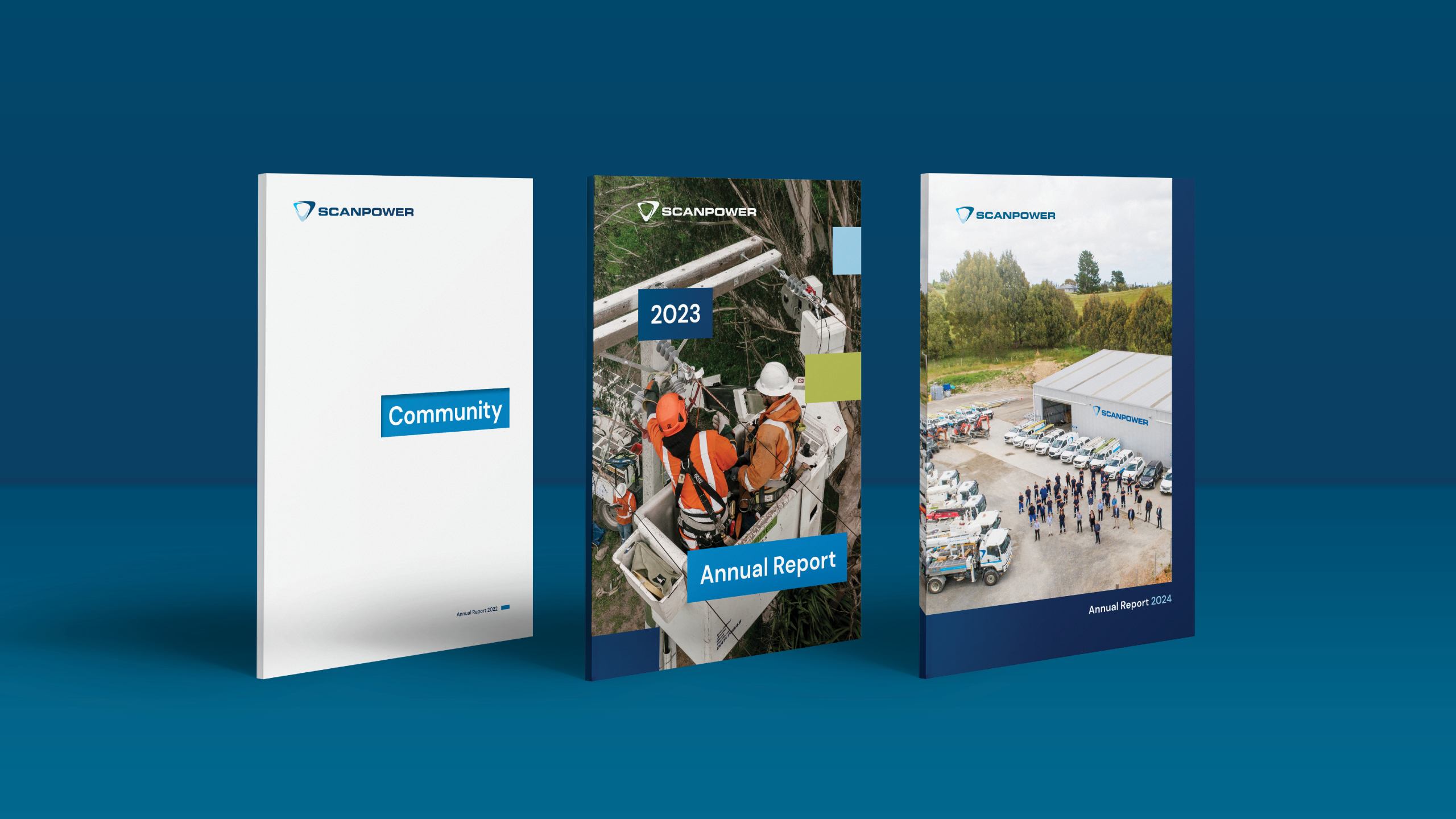
Energising Annual Reports
Communications, Design & Branding
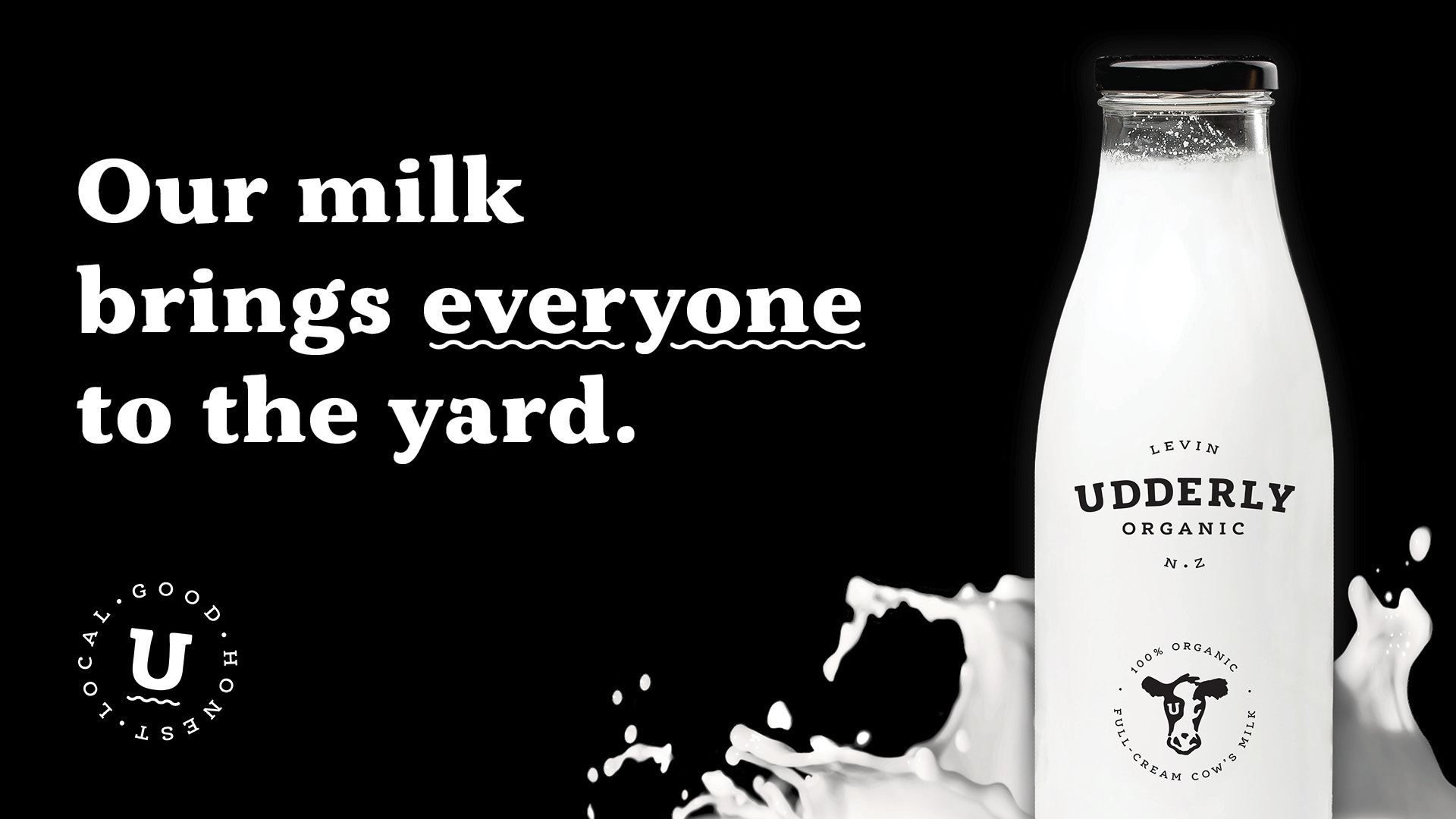
Udderly Organic
Communications, Design & Branding, Websites

Youm
Communications, Design & Branding, Websites
